Product Design
HGV Timeshare Platform
HGV Timeshare Platform
Year :
2023
Industry :
Hospitality
Client :
HGV
Project Duration :
16 weeks

Enter password to view case study
🛑 THE PROBLEM:
Hilton Grand Vacations (HGV) was operating two separate websites with nearly identical purposes—but different user groups, behaviors, and legacy systems. One of these platforms came from the acquisition of a competitor, and HGV was forced to maintain both experiences in parallel to support existing owners.
This created several major issues:
A fragmented user experience
Users didn’t know which site to use. Each platform had different rules, flows, visual styles, and booking limitations. This inconsistency caused confusion, abandonment, and frustration among owners.
High operational costs
HGV was spending significant resources maintaining two full platforms—two codebases, two support systems, two content libraries, and duplicated workflows.
A difficult and outdated booking system
The existing booking engine was:
Hard to maintain
Slow
Difficult to use
Inconsistent in showing availability
Missing options users expected to find
Customers frequently complained that they couldn't find the vacation options they wanted, even when rooms were available.
No mobile capability
The legacy sites were desktop-only. Users couldn’t:
Book on their phones
Manage points
View availability
Handle urgent tasks
This led to missed opportunities and a poor experience for owners who are often traveling.
Complexity around point management
Users didn’t understand:
The difference between saving, depositing, and converting points
The impact of each action
Why certain actions weren’t automated
Why some points were expiring
These issues also translated into high customer support volume.
🔎 RESEARCH & DISCOVERY:
The discovery phase was essential to understanding the complexity of HGV’s legacy ecosystem and the needs of its diverse user groups. This stage revealed the foundation for building a unified, modern platform.
📂 A. LEGACY PLATFORM ANALYSIS:
HGV was operating two separate websites as a result of a prior acquisition. Each platform had its own architecture, visual language, rules, and user behaviors. While both served similar purposes, maintaining them in parallel created major issues:
🔎 Key Findings:
Duplicated operational cost across two codebases, content systems, and support channels
Confusing user experience—owners didn’t know which site to use
Functional inconsistencies that led to user frustration and abandonment
Outdated booking system that was slow, rigid, and difficult to maintain
Desktop-only experience with no mobile support
Limited visibility of availability, leading users to believe no options existed
This analysis provided a clear direction: the two platforms had to be merged into one unified experience.
Old Websites
👤 B. UNDERSTANDING USERS & PERSONAS
To design a system that worked for all owner types, I created a set of Personas informed by analytics, stakeholder insights, behavioral patterns, and user feedback. These personas guided every major design decision.
👤 Personas Defined:


💡C.KEY RESEARCH INSIGHTS:
From interviews, analytics, and stakeholder discussions, we identified the biggest pain points:
Confusion between saving, depositing, and converting points
Unclear deadlines for point expiration
A booking system that felt dated, slow, and difficult to use
No ability to book or manage anything from a mobile device
High drop-off rates on booking and dashboard pages
Users not knowing where to start or what actions were most urgent
Frequent support calls due to unclear system rules
These insights became the foundation for the new UX strategy.

🚀 THE SOLUTION:
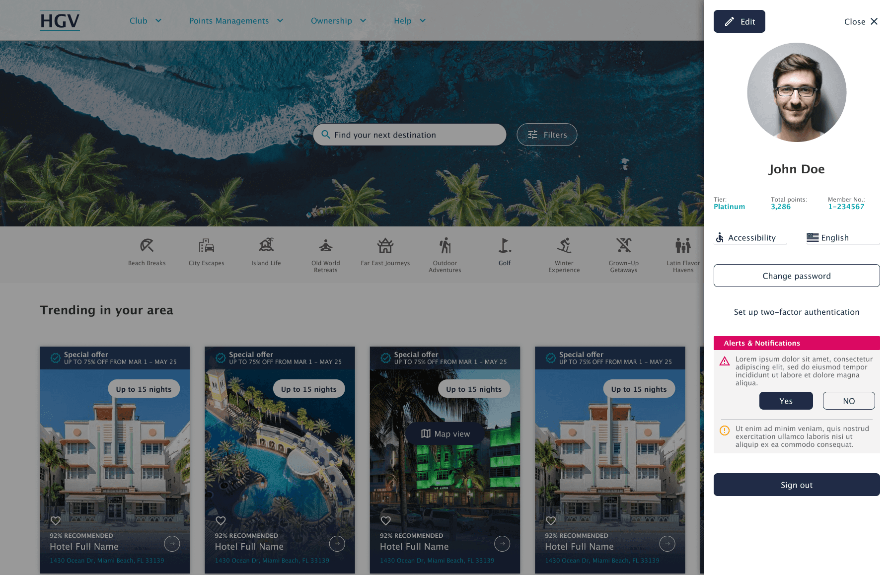
The solution was the creation of a unified, responsive, modern platform that merged both legacy systems into one seamless experience—built around user needs and designed to scale with HGV’s future vision.
A. Unified Platform & Modern Experience
I designed a centralized platform that brought both legacy websites into one consistent system:
A cohesive visual language
A scalable design framework
A reorganized navigation model
A modern, flexible booking engine
Rules and workflows aligned across all user groups
Full mobile responsiveness to match modern travel behavior




✏️ WIREFRAMES & EARLY EXPLORATION
I began designing the experience from scratch with low-fidelity wireframes to explore:
New navigation patterns
Reimagined booking flows
Simplified point management
Clearer step-based processes
Better visual hierarchy
Shorter, task-focused interactions
These wireframes allowed the team to align early and reduce risk before high-fidelity design.

⚠️ CHALLENGE:
The main challenge was merging two fundamentally different legacy systems without alienating long-time users while still introducing modern, mobile-first UX patterns.
Additional challenges included:
Reeducating experienced users with established habits
Translating complex point rules into simple, intuitive interfaces
Maintaining business constraints while reducing friction
Designing a booking experience that worked seamlessly across devices
Aligning internal teams with different priorities
Ensuring clarity for a diverse audience with varying levels of experience
Through collaborative workshops, iterative prototypes, and persona-driven decision making, we delivered a solution that balanced structure, clarity, and flexibility.
📄 SUMMARY:
The redesigned platform transformed a fragmented, outdated ecosystem into a unified, responsive, user-centered experience that supports every type of HGV owner.
🚀 Impact:
Unified two costly legacy systems
Enabled mobile booking and management for the first time
Improved booking clarity and reduced drop-offs
Simplified point management and reduced support calls
Aligned business goals with user needs
Created a scalable foundation for new features and future growth
👤 My Role
Senior UX Designer, UX Researcher.
📦 Key Deliverables
Personas (Figma)
Wireframes (Figma)
High-Fidelity Designs (Figma)
Flows (Miro)
Prototypes (Figma)
Mobile UI (Figma)
UX Strategy (Miro)


More Projects


Product Design
HGV Timeshare Platform
HGV Timeshare Platform
Year :
2023
Industry :
Hospitality
Client :
HGV
Project Duration :
16 weeks
Enter password to view case study
🛑 THE PROBLEM:
Hilton Grand Vacations (HGV) was operating two separate websites with nearly identical purposes—but different user groups, behaviors, and legacy systems. One of these platforms came from the acquisition of a competitor, and HGV was forced to maintain both experiences in parallel to support existing owners.
This created several major issues:
A fragmented user experience
Users didn’t know which site to use. Each platform had different rules, flows, visual styles, and booking limitations. This inconsistency caused confusion, abandonment, and frustration among owners.
High operational costs
HGV was spending significant resources maintaining two full platforms—two codebases, two support systems, two content libraries, and duplicated workflows.
A difficult and outdated booking system
The existing booking engine was:
Hard to maintain
Slow
Difficult to use
Inconsistent in showing availability
Missing options users expected to find
Customers frequently complained that they couldn't find the vacation options they wanted, even when rooms were available.
No mobile capability
The legacy sites were desktop-only. Users couldn’t:
Book on their phones
Manage points
View availability
Handle urgent tasks
This led to missed opportunities and a poor experience for owners who are often traveling.
Complexity around point management
Users didn’t understand:
The difference between saving, depositing, and converting points
The impact of each action
Why certain actions weren’t automated
Why some points were expiring
These issues also translated into high customer support volume.
🔎 RESEARCH & DISCOVERY:
The discovery phase was essential to understanding the complexity of HGV’s legacy ecosystem and the needs of its diverse user groups. This stage revealed the foundation for building a unified, modern platform.
📂 A. LEGACY PLATFORM ANALYSIS:
HGV was operating two separate websites as a result of a prior acquisition. Each platform had its own architecture, visual language, rules, and user behaviors. While both served similar purposes, maintaining them in parallel created major issues:
🔎 Key Findings:
Duplicated operational cost across two codebases, content systems, and support channels
Confusing user experience—owners didn’t know which site to use
Functional inconsistencies that led to user frustration and abandonment
Outdated booking system that was slow, rigid, and difficult to maintain
Desktop-only experience with no mobile support
Limited visibility of availability, leading users to believe no options existed
This analysis provided a clear direction: the two platforms had to be merged into one unified experience.
Old Websites
👤 B. UNDERSTANDING USERS & PERSONAS
To design a system that worked for all owner types, I created a set of Personas informed by analytics, stakeholder insights, behavioral patterns, and user feedback. These personas guided every major design decision.
👤 Personas Defined:
💡C.KEY RESEARCH INSIGHTS:
From interviews, analytics, and stakeholder discussions, we identified the biggest pain points:
Confusion between saving, depositing, and converting points
Unclear deadlines for point expiration
A booking system that felt dated, slow, and difficult to use
No ability to book or manage anything from a mobile device
High drop-off rates on booking and dashboard pages
Users not knowing where to start or what actions were most urgent
Frequent support calls due to unclear system rules
These insights became the foundation for the new UX strategy.
🚀 THE SOLUTION:
The solution was the creation of a unified, responsive, modern platform that merged both legacy systems into one seamless experience—built around user needs and designed to scale with HGV’s future vision.
A. Unified Platform & Modern Experience
I designed a centralized platform that brought both legacy websites into one consistent system:
A cohesive visual language
A scalable design framework
A reorganized navigation model
A modern, flexible booking engine
Rules and workflows aligned across all user groups
Full mobile responsiveness to match modern travel behavior
✏️ WIREFRAMES & EARLY EXPLORATION
I began designing the experience from scratch with low-fidelity wireframes to explore:
New navigation patterns
Reimagined booking flows
Simplified point management
Clearer step-based processes
Better visual hierarchy
Shorter, task-focused interactions
These wireframes allowed the team to align early and reduce risk before high-fidelity design.
⚠️ CHALLENGE:
The main challenge was merging two fundamentally different legacy systems without alienating long-time users while still introducing modern, mobile-first UX patterns.
Additional challenges included:
Reeducating experienced users with established habits
Translating complex point rules into simple, intuitive interfaces
Maintaining business constraints while reducing friction
Designing a booking experience that worked seamlessly across devices
Aligning internal teams with different priorities
Ensuring clarity for a diverse audience with varying levels of experience
Through collaborative workshops, iterative prototypes, and persona-driven decision making, we delivered a solution that balanced structure, clarity, and flexibility.
📄 SUMMARY:
The redesigned platform transformed a fragmented, outdated ecosystem into a unified, responsive, user-centered experience that supports every type of HGV owner.
🚀 Impact:
Unified two costly legacy systems
Enabled mobile booking and management for the first time
Improved booking clarity and reduced drop-offs
Simplified point management and reduced support calls
Aligned business goals with user needs
Created a scalable foundation for new features and future growth
👤 My Role
Senior UX Designer, UX Researcher.
📦 Key Deliverables
Personas (Figma)
Wireframes (Figma)
High-Fidelity Designs (Figma)
Flows (Miro)
Prototypes (Figma)
Mobile UI (Figma)
UX Strategy (Miro)
More Projects
Product Design
HGV Timeshare Platform
HGV Timeshare Platform
Year :
2023
Industry :
Hospitality
Client :
HGV
Project Duration :
16 weeks
Enter password to view case study
🛑 THE PROBLEM:
Hilton Grand Vacations (HGV) was operating two separate websites with nearly identical purposes—but different user groups, behaviors, and legacy systems. One of these platforms came from the acquisition of a competitor, and HGV was forced to maintain both experiences in parallel to support existing owners.
This created several major issues:
A fragmented user experience
Users didn’t know which site to use. Each platform had different rules, flows, visual styles, and booking limitations. This inconsistency caused confusion, abandonment, and frustration among owners.
High operational costs
HGV was spending significant resources maintaining two full platforms—two codebases, two support systems, two content libraries, and duplicated workflows.
A difficult and outdated booking system
The existing booking engine was:
Hard to maintain
Slow
Difficult to use
Inconsistent in showing availability
Missing options users expected to find
Customers frequently complained that they couldn't find the vacation options they wanted, even when rooms were available.
No mobile capability
The legacy sites were desktop-only. Users couldn’t:
Book on their phones
Manage points
View availability
Handle urgent tasks
This led to missed opportunities and a poor experience for owners who are often traveling.
Complexity around point management
Users didn’t understand:
The difference between saving, depositing, and converting points
The impact of each action
Why certain actions weren’t automated
Why some points were expiring
These issues also translated into high customer support volume.
🔎 RESEARCH & DISCOVERY:
The discovery phase was essential to understanding the complexity of HGV’s legacy ecosystem and the needs of its diverse user groups. This stage revealed the foundation for building a unified, modern platform.
📂 A. LEGACY PLATFORM ANALYSIS:
HGV was operating two separate websites as a result of a prior acquisition. Each platform had its own architecture, visual language, rules, and user behaviors. While both served similar purposes, maintaining them in parallel created major issues:
🔎 Key Findings:
Duplicated operational cost across two codebases, content systems, and support channels
Confusing user experience—owners didn’t know which site to use
Functional inconsistencies that led to user frustration and abandonment
Outdated booking system that was slow, rigid, and difficult to maintain
Desktop-only experience with no mobile support
Limited visibility of availability, leading users to believe no options existed
This analysis provided a clear direction: the two platforms had to be merged into one unified experience.
Old Websites
👤 B. UNDERSTANDING USERS & PERSONAS
To design a system that worked for all owner types, I created a set of Personas informed by analytics, stakeholder insights, behavioral patterns, and user feedback. These personas guided every major design decision.
👤 Personas Defined:
💡C.KEY RESEARCH INSIGHTS:
From interviews, analytics, and stakeholder discussions, we identified the biggest pain points:
Confusion between saving, depositing, and converting points
Unclear deadlines for point expiration
A booking system that felt dated, slow, and difficult to use
No ability to book or manage anything from a mobile device
High drop-off rates on booking and dashboard pages
Users not knowing where to start or what actions were most urgent
Frequent support calls due to unclear system rules
These insights became the foundation for the new UX strategy.
🚀 THE SOLUTION:
The solution was the creation of a unified, responsive, modern platform that merged both legacy systems into one seamless experience—built around user needs and designed to scale with HGV’s future vision.
A. Unified Platform & Modern Experience
I designed a centralized platform that brought both legacy websites into one consistent system:
A cohesive visual language
A scalable design framework
A reorganized navigation model
A modern, flexible booking engine
Rules and workflows aligned across all user groups
Full mobile responsiveness to match modern travel behavior
✏️ WIREFRAMES & EARLY EXPLORATION
I began designing the experience from scratch with low-fidelity wireframes to explore:
New navigation patterns
Reimagined booking flows
Simplified point management
Clearer step-based processes
Better visual hierarchy
Shorter, task-focused interactions
These wireframes allowed the team to align early and reduce risk before high-fidelity design.
⚠️ CHALLENGE:
The main challenge was merging two fundamentally different legacy systems without alienating long-time users while still introducing modern, mobile-first UX patterns.
Additional challenges included:
Reeducating experienced users with established habits
Translating complex point rules into simple, intuitive interfaces
Maintaining business constraints while reducing friction
Designing a booking experience that worked seamlessly across devices
Aligning internal teams with different priorities
Ensuring clarity for a diverse audience with varying levels of experience
Through collaborative workshops, iterative prototypes, and persona-driven decision making, we delivered a solution that balanced structure, clarity, and flexibility.
📄 SUMMARY:
The redesigned platform transformed a fragmented, outdated ecosystem into a unified, responsive, user-centered experience that supports every type of HGV owner.
🚀 Impact:
Unified two costly legacy systems
Enabled mobile booking and management for the first time
Improved booking clarity and reduced drop-offs
Simplified point management and reduced support calls
Aligned business goals with user needs
Created a scalable foundation for new features and future growth
👤 My Role
Senior UX Designer, UX Researcher.
📦 Key Deliverables
Personas (Figma)
Wireframes (Figma)
High-Fidelity Designs (Figma)
Flows (Miro)
Prototypes (Figma)
Mobile UI (Figma)
UX Strategy (Miro)